


Shop Now
Chawton Low Double Dresser
£6,570
 27 Feb 2024
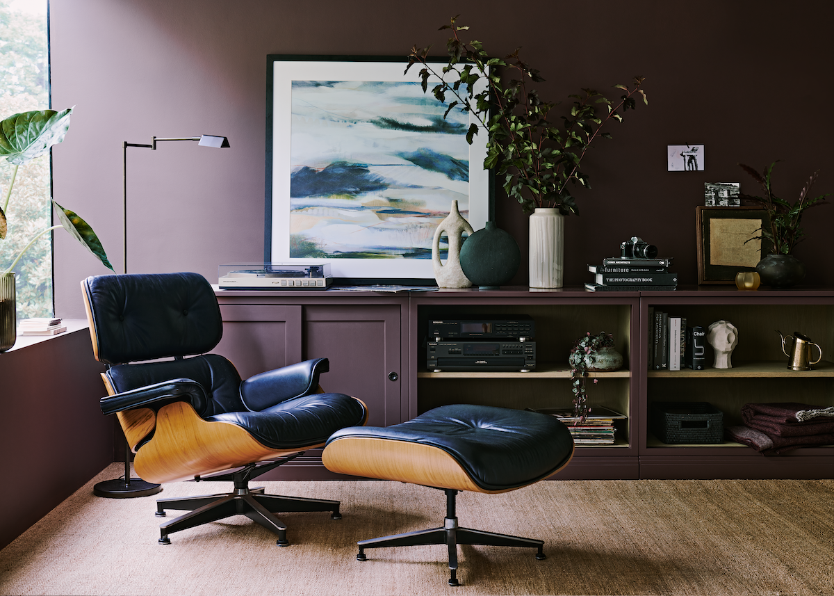
Decorating with bold colours brings new energy to a room. Mood-lifting shades focus the mind for maximum impact, inject personality into your living spaces and make your home feel more joyful and dynamic.
For what seems like decades, the prominent home trend has been minimalist interiors: neutral palettes, pared-back colours, lots of texture. But there's something incredibly alluring about richly-decorated rooms that are bursting with colour.
Annie Blackledge, part of the Interior Design team at Holloways, shares her tips on how to use colour to in your home to maximum effect, using paints from Neptune and Edward Bulmer, all stocked in our Worcestershire showrooms.

"More is more when it comes to colour," says Annie. "But this isn't about throwing bold shades together and hoping it works. It's about a carefully-curated mix of colour and pattern that spells thoughtful luxury and engages the senses. Decorating is both a science and an art."
Look at opposites on the colour wheel to create a complementary scheme – cobalt blues with oranges, for example. Rich, verdant greens with pinks. Or experiment with a monochrome scheme – different colours from the same tonal family, all working together in harmony for a minimalist feel to a maximalist scheme.

"This makes a space feel effortlessly designed and much more cohesive," says Annie. "Analogous colours – those which sit next to each other on the colour wheel – also make for harmonious schemes. Add pattern and texture for extra visual interest in a room."

"It can be difficult to know where to start," says Annie. "But take your colour inspiration from a treasured piece – a rug, a painting, a chair – and build your scheme around that. This will create instant cohesion and make your colour choices feel effortless, plus it gives you permission to use every colour found in that piece."

Use blocks of colour for maximum impact, says Annie. "Paint cabinetry the same colour as the walls, and add accessories and soft furnishing in the same shade. This creates a cohesive, minimalist look, yet it's still bold enough to inject drama and personality."

Try a brightly-coloured sofa with walls in a lighter shade from the same tonal family, for example, and add a complementary rug and window treatments to bring the whole scheme together. Add a secondary colour in the form of a painting, or a footstool, for real impact.


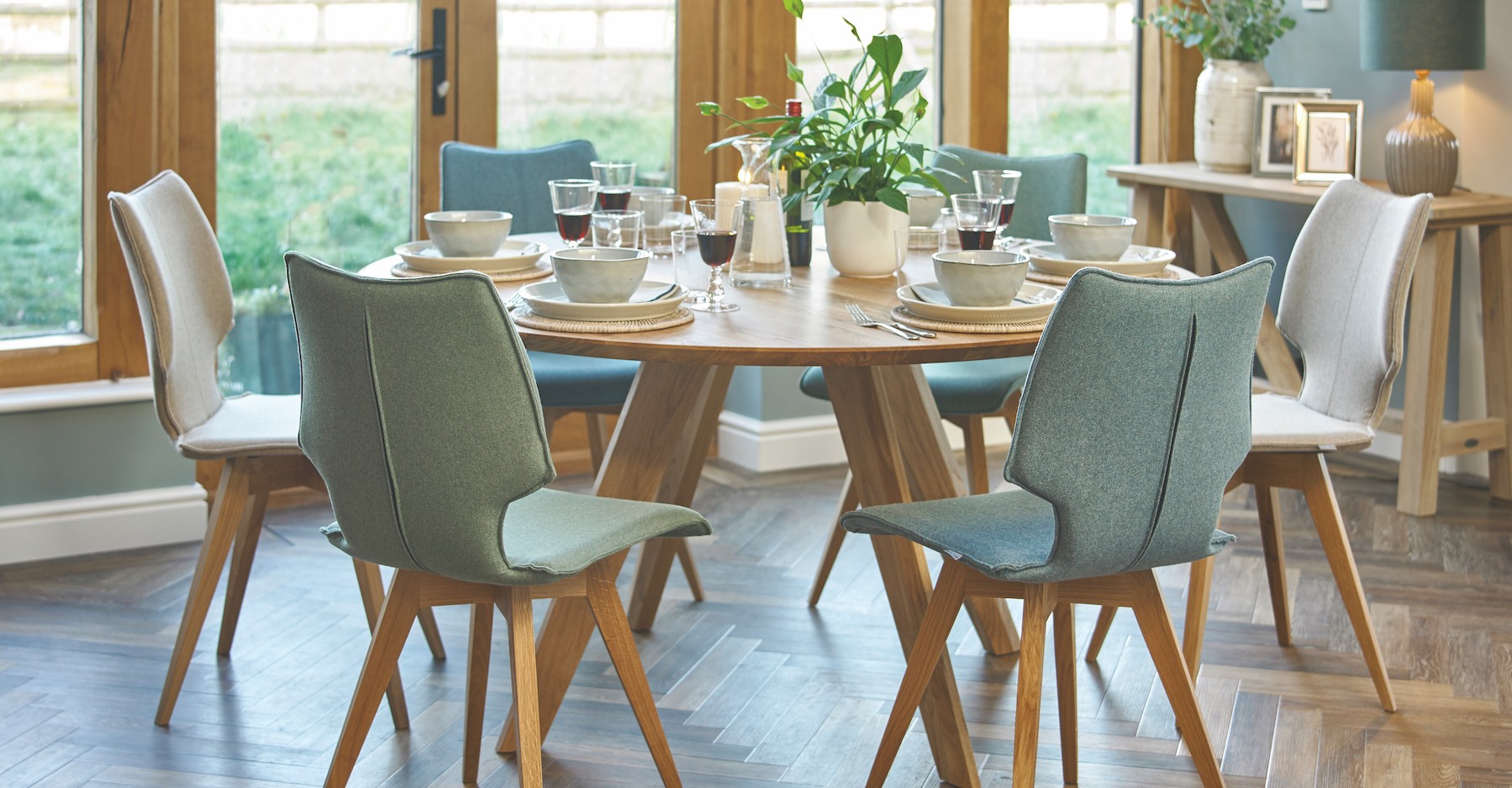
"Dining rooms are a great place to start with a dramatic colour scheme," says Annie. "Because they're not high-traffic areas, decorating in a bold colour won't overwhelm. Make bright colours pop with a bold backdrop – try Neptune's rich purple/red shade, Clove, accented with golds and burnt oranges in upholstery, lampshades and even curtains."


Inspired by Swedish design culture, this concept is all about finding a colour theme and carrying it through every room in your home to create a cohesive interior. It links spaces and binds them together as a whole house, rather than a series of disparate rooms. Pieces don't have to be big – a lampshade, a painting, a cushion – and it doesn't have to be red.

A blue runner in a hallway links to a blue lamp in the sitting room, an ink island in the kitchen, a striking blue vase in the cloakroom, a blue-based heirloom portrait in the bedroom. It's about thinking of the house as a whole when you redecorate, rather than one room at a time.


Ceilings are often overlooked and the go-to pure brilliant white is often jarring, particularly in a bold scheme.
"Painted ceilings are becoming popular again," says Annie. "It's a really up-to-date way to introduce colour to a room, whatever size and shape, and makes a bold design statement. I'm always led by the detail in the room as to how far to take it – picture rails, cornicing, panelling lead the eye naturally."
The rule of three is a device used by interior designers. Using just one or two colours can make a space feel flat, using three brings energy and dynamism to a scheme. Use the main colour for 60-70% of the room; a secondary colour for 20-30% and an accent colour for the other 10%. Using a bold colour on every wall might feel overwhelming – try a feature wall, or the chimney breast, rather than every surface.

If you're nervous about introducing colour to your home, start with a small space – a downstairs cloakroom, a spare bedroom. And you don't even have to tackle the walls if it all feels too intimidating.
"Start slowly by introducing blocks of colour in the form of cushions, rugs and throws if you're not quite ready to throw buckets of vividly-coloured paint at your neutral walls," says Annie. "This way you can experiment with bright colours like oranges and reds without committing to a whole-scale redesign project. It's a good way to introduce colour without commitment and to find your decorating confidence."
Looking for ways to make a small room look bigger? Read Annie's expert advice here.
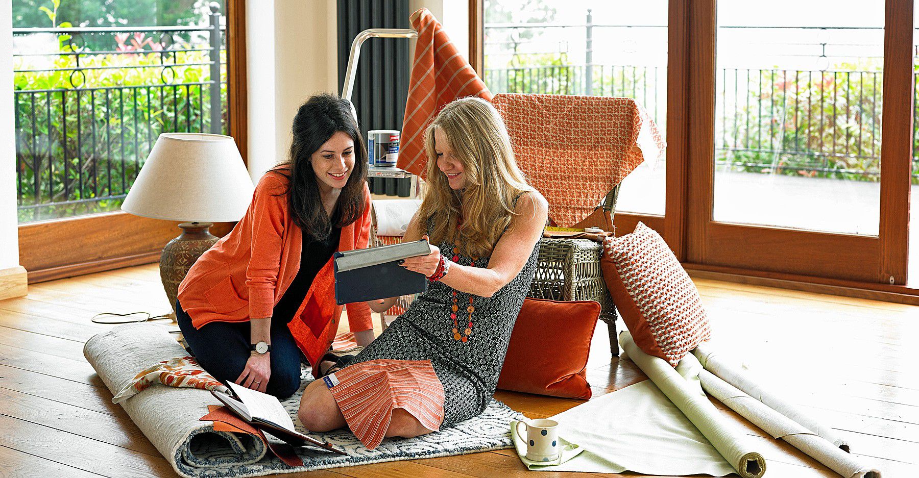
Need some inspiration? Our designers are always on hand to help and advise, and our Interior Design Service is FREE. Simply visit our showrooms, pick out some pieces that inspire you and book an initial consultation with Annie or one of the team. They'll walk through your project with you, create mood boards and help you select furniture and fabrics you'll love, to make your house a home.
Call us on 01886 884665 to book an initial appointment.
