


Shop Now
Chawton Low Double Dresser
£6,570
 10 Mar 2025
Heritage colours are making a comeback. From burnt oranges to rich reds, burgundies to browns, discover the six nostalgic paint shades interior designers are using this year.
For centuries the farmhouse kitchen colour du jour, sunny yellows are at once uplifting and cocooning. Cheerful and welcoming, they bring instant sunshine to sitting rooms and snugs, bathrooms and home offices alike.

'Persian' by Edward Bulmer Natural Paint is sensational in this cloakroom, above. Neptune's 'Saffron', above right, is a favourite of Victoria Twinberrow, Neptune by Holloways' design specialist. Richly-pigmented, it's a grounded and warming yellow. Try it paired with 'Salt' for freshness, or blue-black 'Ink' or rich 'Burnham Red' for a playful touch. Risk-averse? Introduce yellow as a pop of colour to cabinetry rather than going all-out on the walls.

This attention-grabbing purple-red, redolent of gentlemen's clubs and state rooms alike, spells timeless luxury and rich heritage. Fabulous on kitchen cabinetry, beautiful in a bedroom or downstairs bathroom where you can afford to go bold, burgundy is always regal and cocooning.

Annie Blackledge, Interior Designer at Holloways, loves Neptune's 'Burnham Red' in a dining room. "Double-drenched on walls and cabinetry, it makes a dramatic statement and looks incredible in candlelight," she says. At the more plummy-brown end of the burgundy scale, 'Clove' is equally decadent with a sophisticated, retro feel.

Ranging from earthy terracotta to warm brick and flame, oranges are at the top of designers' wish-lists this year. Rich with Seventies nostalgia, these fiery hues are at once dramatic and comforting.
'Malahide', by Edward Bulmer Natural Paint, below right is full of energy, taking over whatever room it's in. It lends itself perfectly to statement walls in contemporary interiors paired with warm neutrals and light wood. In period rooms, its oxide-rich colour makes gilt frames and mahogany furniture pop.

Neptune's 'Bracken' – above left and below right – is slightly more muted, taking its earthy inspiration from the carpet of ferns that blanket hillsides and moors in autumn and winter. Warm, softened with hints of brown and mustard, it feels subtly Victorian – bold in a boot room, energising in a kitchen and a striking backdrop for art in a sitting room or library. Edward Bulmer's best-seller 'Sang de Boeuf' and 'Brick', below left, are undeniably grand and imposing.

Read more about Bracken in our Journal.
Pinks don't get any more versatile than Neptune's 'Potters Pink'. With undertones inspired by the rich reds of 17th century military uniforms, this warm neutral is softly feminine, yet masculine, all at the same time. In the Holloways showrooms, we've used it in the sitting room of our Neptune store-in-store, paired with a huge gilt mirror over the fireplace flanked by an Olivia sofa in Pale Oat linen, and the Eliza sofa in Linara Moss.
"It's beautiful in a bedroom," says Victoria. "And you can pair it with almost anything from warm neutrals to russets, soft greens and yellows. It takes on different qualities at different times of the day, at different times of the year."

'Rose Tinted White' by Edward Bulmer Natural Paint has the same, delicate, barely-there quality. A soft light, rather than a colour. It's a reddy off-white, made with rede art and madder root pigment – Red Oxide and Vermillion. It's at its most beguiling in classic interiors paired with natural oak – soft without being sugary. See it in a kitchen, top right. 'Jesse', 'Cuisse de Nymphe Emue' and 'Jonquil' (below) are other, versatile pinks by Edward Bulmer.
 copy.jpg)
This year's wedding colour of choice, it's no surprise that peach is making an interiors comeback. With a whiff of Eighties nostalgia and English country house vibes, peach, and its close cousin coral, are reminiscent of faded plaster, Italian stucco and Mediterranean summers.
"These earth tones and mineral pigments create a soft, welcoming feel," says Annie. "Peach, coral and soft pinky-browns are timeless and easy to live with – there's nothing sugary about them. They're the perfect backdrop to modern art and bring depth and freshness to contemporary and classic schemes."
'Dutch Orange' by Edward Bulmer Natural Paint is elegant and warming in a dining room. 'Hespan' is another coral-pink perfectly suited to cosy sitting rooms.

No, we're not talking the deep, chocolate browns of flock wallpaper. This year's browns are softer, less intense and more earthy than their Seventies counterparts. 'Mummy' (below left) by Edward Bulmer is perfect for a cosy snug or sitting room and connects country kitchens with the outside world. Paired with 'Mouse Grey' it becomes much more contemporary. With 'Cerullian Blue', elegant and timeless.

'Peat', below, by Neptune has the soft hue of cocoa powder and works well with cooler shades like 'Shell' and 'Snow'. 'Lead Light', above right, is its earthy brown sibling with pleasing hints of olive and khaki. It's warmed with wood or beige tones, like 'Limestone' or 'Dove Grey', and cooled by soft greys like 'Shingle'.
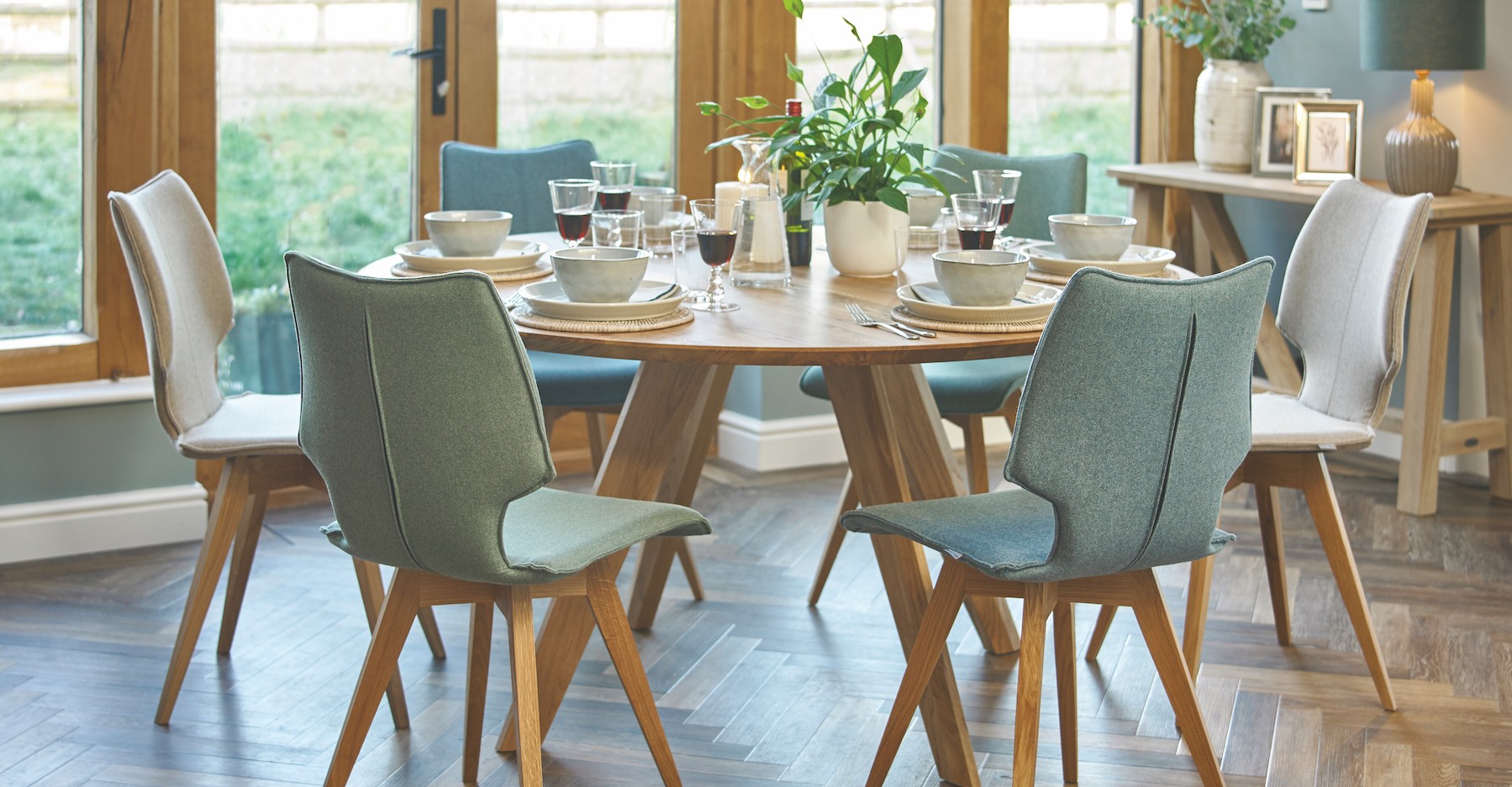
"It's wonderful on walls and woodwork in modern country homes – a classic with oak and rush furniture like the Wycombe dining table and Tilbury chairs, and lifted with a pop of red, either on furniture or artwork," says Victoria.

Discover the full range of Edward Bulmer Natural Paint and Neptune paint at Holloways. We stock emulsion and eggshell and our designers are always on hand to help and advise. Call us on 01886 884665 for up-to-date stocks of each colour and finish.